


Tail of a Cucumber

Hover over the thumbnail for a full-size version.
| Author | ampburner |
|---|---|
| Tags | action author:ampburner rated |
| Created | 2009-07-27 |
| Last Modified | 2009-07-27 |
| Rating |
4 by 11 people.
|
| Map Data | |
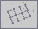
| Description | Well this is my second map. I tried to make it look nice... |
Other maps by this author
 |
| Burnt Frost |
Comments
Pages: (0)

Even though that might not look a 100% possible.
There both on the experienced side of life.
Just make sure you always know what you want, never randomize.
There both on the experienced side of life.
Just make sure you always know what you want, never randomize.

2009-07-28
I completely disagree with maximo.
Aesthetics are JUST as important as gameplay.
As I say in my guide, a map that plays like a classic but lacking in looks next ot a map that plays like a classic with a striking and unique visual style pales completely.
You need to get into habit of creating the visual look AND the gameplay similtaneously.
And you can work on the visuals first and add gameplay later and still have a very playable map. Many of my most popular maps have been made this way, so it's a tried and tested formula.
Obviously, most map making is about opinion, but I the one thing I'll always stand by as a completely objective and (if you ignore it, a potentially very damaging) obvious ideal is that style and content are of absolutely equal importance.

2009-07-27
I also see very little of Atob
It reminds me of TEP, rather a generic tileset, verging on ugly, and overused gold. Try and stay innovative and original both in aesthetics and gameplay. Gold felt a little overused as well.
2009-07-27
I wonder.....
Yeah....

2009-07-27
My advice
Don't spend so much time worrying about how the map looks. I can tell you did by how some parts play, with a clear form before function feel to them.
You sacrificed gameplay for looks, and even though the map looks nice, it plays just okay.
Put your efforts into make maps that play well first, and in fact, I would almost completely forget about aesthetics until after you've playtested the shit out of your map.
Gameplay is that much more important.

2009-07-27
http://www.nmaps.net/135135
I thought it looks pretty similar to that map.

2009-07-27
atob
right - I agree, it doesn't even come close to holding up to your gameplay standards (no offense ampburner, it'll probably come with experience, 'sides it's only your 2nd map :P)
but yeah, it was just a reference to the tile layout.
peace
but yeah, it was just a reference to the tile layout.
peace

2009-07-27
I can't see much of me in this.
I think it's more that you're really tidy with your placement and I overused these tile shapes for a while.
This isn't as striking as your first, in fact it's really quite generic. My new philosophy is make sure every map I produce has something striking/strongly themed/unique about it, I think that's important.
This isn't as striking as your first, in fact it's really quite generic. My new philosophy is make sure every map I produce has something striking/strongly themed/unique about it, I think that's important.


2009-07-27
I know an atob map when I see one
.

2009-07-27
very nice
excellent placement of objects, and very nice tiles. I think some of the gold was a tad hard to get to. Have you got another account?? coz this is brilliant for a second.
probably lacking a tiny bit of flow. 4.5^
probably lacking a tiny bit of flow. 4.5^

2009-07-27
And it's a beauty
The rocket is a bit hard and a gauss might have been easier or more relaxed :) Overall this map is brilliant! I don't rate beginners maps higher but this definately deserves 4 or 5
TheEverPresent
aww ganteka