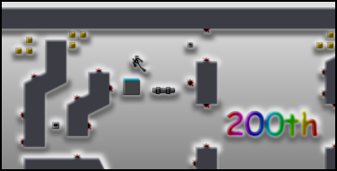
Carnivorous Wildlife
Hover over the thumbnail for a full-size version.
| Author | Why_Me |
|---|---|
| Tags | 200 author:why_me playable puzzle rated |
| Created | 2010-07-26 |
| Last Modified | 2010-07-26 |
| Rating |
4 by 9 people.
|
| Map Data | |
| Description | 
My 200th map. I think that this is a pretty good map; I would like to know what you think. AGD included, but please try to complete the map without it. |
Other maps by this author
Comments
Pages: (0)
2010-07-27
i gave it a 3.
meaning, an average map.
2010-07-26
*quite a few superfluous mines
2010-07-26
This wasn't my kinda thing.
I agree with blackson about having to watch your demo first. If you don't watch your demo, it's just too much guesswork. I thought there were quite a few superfluous, but it didn't bother me. Anyway, congratz on 200 maps. 3/5
2010-07-26
I agree
with traction. It appears you covered every surface that didn't require a particular jump with a mine. You sacrificed any hopes for aesthetics right there.
Moving on to the map: is this supposed to be an image map? The image in the description suggests so but there aren't any picture URL's at the end of the data. So yeah, if you meant for this to be an image map, you might want to address that. The actual gameplay was annoying. The tiles didn't really support any jumps outside of what the map was made around (it felt very scripted). The hidden thwumps were pretty silly (it required you to watch the demo first. It wasn't a "figuring out" it was a falling ass-backwards into them). Also the tiles lacked any sense of style.
I see what you were going for, it just was too cluttered and no freedom was given to do anything other than play the map a single way.
Take from all of this what you will, just speaking my mind here.
2010-07-26
**********
too many mines
2010-07-26
Happy 200
And cool map and image. The map is very difficult, but has an interesting concept.
2010-07-26
Happy 200!
Cool map!


Ferox