


Logarithm
Hover over the thumbnail for a full-size version.
| Author | nevermore |
|---|---|
| Tags | author:nevermore rated test |
| Created | 2005-12-31 |
| Last Modified | 2005-12-31 |
| Rating |
3 by 12 people.
|
| Map Data | |
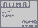
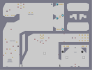
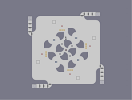
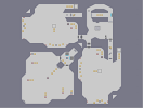
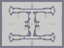
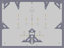
| Description | A few new NUMA logo ideas.
I'm quite partial to the ones in the bottom right corner. The others are kind of weird. The ninja and the chaingun were just the result of me playing around with items. I decided that because both the items are black, they'd look good against the grey background. Tell me what you think. |
Other maps by this author
 |
 |
 |
 |
 |
 |
| Dessert | Apple Blossom | terminalackery go! | Atonement | +Hb!l=| | That's Terrible News! |
Comments
Pages: (0)
2006-02-21
Cool
They'd all make some good fonts! I particularly like the top left one and the middle right. Just goes to show how far the imagination can go with just a few types of tiles. Well done :)
2005-12-31
Fixed
Sweep, my only problem with your design is that it's just too bland.
Everything's very square, and it just doesn't look interesting. I don't particularly like the ninja's pose either.
Everything's very square, and it just doesn't look interesting. I don't particularly like the ninja's pose either.

2005-12-31
The top left is the only one...
...polished enough to make a logo. However, the fact that it's almost a riddle to read what it says rules it out completely.
I don't think you guys understand why I made the current one how it is. It's simple, bold, and isn't attempting to outgrow the current website design too much.
I don't think you guys understand why I made the current one how it is. It's simple, bold, and isn't attempting to outgrow the current website design too much.

2005-12-31
theyre good
but i still dont get this new fad

2005-12-31
top left is good
but the a needs a 5 tile in the middle of it to make it an A
2005-12-31
to be honest
i think the pixely one is kinda cute ^^
mr_pac
anybody wanna look at