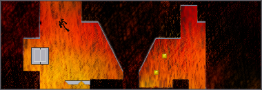
The Core
Other maps by this author
Comments
Pages: (0)
2009-12-27
:)
Nice, level, nice image but a little decaled... 4/5
2009-09-12
HEELP
Usually when I do foreground it covers the whole map so you can't see? How do I fix it?
2009-09-12
DEMO
groovy image map.
| Demo Data |
|---|
2009-09-08
THE MINES WERE TOO HARD TO SEE ;o;
2009-09-08
A somewhat minor thing
But I think the image should be made about two pixels larger in height, because the way it is now makes it look off. (preferrably, move the image down two pixels and add two pixel lines to the top - this should align everything I think) Also, I would remove any and all text from the tileborders when taking a screenshot of the map to make an image, so that they don't get in the way of the actual text while playing. (i.e. NReality and the link, framecount, Highscores, speedrun, or underclock, Grid, Score Time) Again, a relatively minor thing, but this way there is no chance of text misalignment.
Anyways, I like how it's dark and hard to see at the bottom, but light and easier to see as you go up. At least assuming that the person playing is using a dark ninja. I agree with techno-chocolate about the mines though, they are pretty hard to see - especially for me, because I have to play in 256 colors, and that tends to make image maps extremely grainy.
Anyways, I like how it's dark and hard to see at the bottom, but light and easier to see as you go up. At least assuming that the person playing is using a dark ninja. I agree with techno-chocolate about the mines though, they are pretty hard to see - especially for me, because I have to play in 256 colors, and that tends to make image maps extremely grainy.
2009-09-08
I hated those hidden mines!
I don't notice the mines until I blow up into them.
| Demo Data |
|---|
2009-09-07
Speedrun
| Demo Data |
|---|
2009-09-07
Nice image.
lovin the gameplay too.
2009-09-07
Looks nice
AGD-2
Not sure if those two would make it faster.
Not sure if those two would make it faster.
| Demo Data |
|---|


HerefortheHolidays
I like it.