


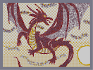
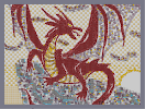
Dawning Dragon 2
Hover over the thumbnail for a full-size version.
| Author | cucumber_boy |
|---|---|
| Tags | author:cucumber_boy bitesized n-art rated |
| Created | 2007-05-28 |
| Rating |
4 by 29 people.
|
| Map Data | |
| Description | Took Some Suggestions and added 2 hours to total work time |
Other maps by this author
 |
 |
 |
 |
 |
 |
| Concept Dragon | Concept Dragon Part 2 | Green Dragon Part 4 | Green Dragon Part 5 | Gradient | Dawning Dragon |
Comments
Pages: (0)
2007-05-29
thats freakin awesome
man your good 5/5 =)

2007-05-29
ok

2007-05-29
ok

2007-05-28
Oh and
I love the texturing on the dragon, but the wings are still a bit wierd. Get rid of the white parts...
2007-05-28
Ok...
wtf? Dragons can levitate? =/
The first one was like... 5x better. We were just saying not to use thwumps to color the rock. ROCKS AREN'T BLUE!!!
3.5
The first one was like... 5x better. We were just saying not to use thwumps to color the rock. ROCKS AREN'T BLUE!!!
3.5

2007-05-28
FIRST ONE WAS BETTER
The dragon is amazing and it looks a bit better without the rock, but now it looks weird because the dragon is in a kind of crouching pose, but there's nothing under it.
4.5/5 just because it's not as good as the other.
And who bitesized this?!? Bitesize one or the other, not both.
4.5/5 just because it's not as good as the other.
And who bitesized this?!? Bitesize one or the other, not both.

and then add muscles and call in done? 9along with some of the other suggestions
maybe make it like a fight scene? (somewhat like fire and ice by nematacyst)
http://numa.notdot.net/map/76141
change up the clouds a little
maybe add fire infront of the right wing? delete tounge
circularize the sun :) (I have been having trouble with this, I might have to trace)
make the dragon shiny
I kind of like the neck how it it though!
Is that everything That I have to do?
Change Up Claws
2007-05-28
Just some negative things about this one
The sun isn't round (hard to do it though), the tongue of the dragon doesn't look natural (I rather have none) and the clouds are blur and weird.
The wings seem wrong, and the membrane of the wings needs more shine (look at Afternoondragon Step04). I didn't like how the toes of this dragon looks like toad feet compared to Afternoondragon's claws, and there are no details like muscles and so on. The top part of the neck is too small, and the shine on the body is not obvious (I don't even know if there is shine).
Sorry if I sound very bad, but if you want a chance in the Dronies, at least put more effort into details, and not scatter your objects around.
3.5, because there are some good parts about this one.

2007-05-28
Very nice, but...
...it looks a little unnatural without the rock. Also, like it was said on the previous version, it looks very similar to Afternoon Dragon, and at the same time is nowhere near as good as it. The sun isn't...circular...and the dragon's head looks a bit messed up. However, all I'm doing here is finding all the flaws I can - it is an amazing piece of N-Art, and at first glance definitely does look good. So, everything taken into account, I'd give it a 4/5. The main problem for me is it's undeniable similarity to Afternoon Dragon.
2007-05-28
better than last time.
therefore, 4/5 still not very original though

2007-05-28
Great N-art,
But less points for originality. Since Afternoondragon got 4.5, you get 4 from me. ^_^
2007-05-28
ok
please be specific on what exactly is "wonky"
2007-05-28
wonky
I love that word!!!
IRC!!!!
IRC!!!!
2007-05-28
A little better than the first
But the dragon looks a little wonky to me. 3.5/5
2007-05-28
hmmm
mustv taken some time
:P
:P
2007-05-28
whoo hoo
yay first to vote
5/5
5/5
teraza
that is so 3d